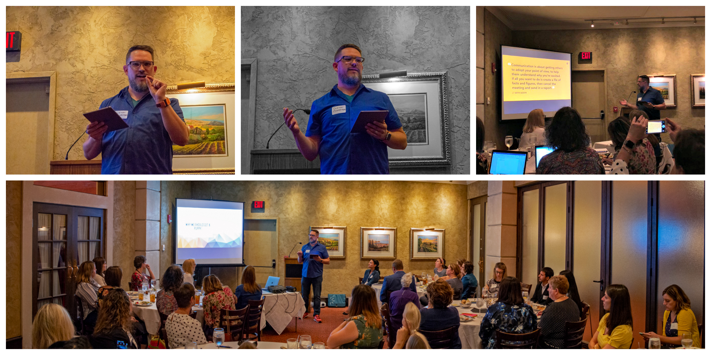
Clifton Alexander of Reactor Creative Studio
KC IABC speaker Clifton Alexander demonstrated how to keep audiences engaged.
By Roy Harryman
I’ve sat through many lifeless PowerPoint shows. But until last month, I’d never been educated on how to make the most of the visual medium (AKA how to give a PowerPoint show that doesn’t blow).
KC IABC featured Clifton Alexander on the topic “How to Create Striking and Effective Visual Presentations.”
I was not disappointed: His talk was both striking and effective. And visual.
“Clifton pointed out that literally millions of forgettable visual presentations are created daily. You don’t want yours to join the scrapheap of mundane talks.”
So how can you stand out?
First, ask yourself if a visual presentation – or even a presentation – is needed. If you simply need to share numbers, then email the figures to everyone. There’s no need for a presentation, let alone a meeting. Save a visual presentation for something that will be enhanced by imagery.
Next – and this is a must for all presentations – determine your goal. While this sounds fundamental, I’m still shocked out how many people skip this part. The bottom line: What do you want the audience to do and think as a result of your talk?
Now, about the “striking and visual” part: It’s all about causing the audience to stay awake and engage with you and your cause.
Here’s one idea. Clifton demonstrated a live, interactive poll. He asked audience members to text their preferences on a topic. Their answers were immediately shown on the screen. It was an instant hit. You can go and do likewise.
Think visual
Another tip: If you’re giving a visual presentation, you have to think, well, visually.
Often, PowerPoint is used like an encyclopedia, with numerous details shared on fast-flipping screens. Yet visual presentations don’t lend themselves to details. If you have a lot of data, share it separately or make your presentation available for download so people can digest the facts and figures.
Clifton said it’s best to visualize a presentation as billboard. When you drive by a billboard at high speed, how much information can you really retain? An image? Three words? You simply can’t read more without ending up in a 27-car pileup.
Less is more
Now here comes a cliché, but in this case, it’s right on: Less is more.
“Simplicity is the glory of expression.”
You, the speaker, are the star. Your slides are merely supporting actors. Don’t rearrange that order.
To PowerPoint or not to PowerPoint?
PowerPoint is well known, but should you use it? There’s not a simple answer. The main issue, however, is the way you use it or any visual presentation software. Clifton’s admonishment is to avoid cookie-cutter templates. You can use PowerPoint, Canva, Keynote or import PDFs from another program. Just don’t use the same design everyone else does (remember those millions of presentations created daily?). For example, you can use PowerPoint but get a fresh template from www.theslidequest.com for $20.
And finally …
When preparing for a visual presentation, Clifton recommended a full embrace of Murphy’s law: If something can blow up, it will. So be prepared. He brings his own HD projector, extension cords, adapters and duplicates. That way if the roof falls in, the show can still go on.
This, incidentally, helps reduce the presenter’s stage fright. You don’t have to worry about technical failures.
Instead, your mind is free to worry about everything else.
Bravo Clifton!
Now let’s put on a good show.
Roy Harryman is a volunteer with KC IABC and the principal of Roy Harryman Marketing Communications.

